Friday 27 November 2015

Task 1b- Primary Research Digital

Contact Prints-


Evaluating-

 Whilst shooting, I knew I wanted to include a few beauty images. So, I went to the hair and beauty part and asked if it would be possible to shoot some images. The lighting for this image is artificial however, because the room is glass, a lot of natural light also was available. Non-the-less, the main light source was artificial light that was already located around the mirror, which is the glass. I chose this image out of all of them because its not the most obvious reflection and I like that. Also, the woman doing the make-up has a natural smile of her face. The lighting hits the woman having the make-up done beautifully, highlighting all the high points of her face. 

The main light source for this image is artificial however, because it was during the day, I turned my aperture down so not a large amount of natural light was coming through. The whole ides of this image was the leading lines of the lights, which are the glass, as well as the light covers. I wanted a close up of one of the lights to make it clear of what the lights were. I did shoot a lot of images trying to get the angle and the light exposure right, including a low angle shot but personally, I didn't like the effect. 

This image was shot in Centenary Square during a bright but cloudy day. This combination made perfect conditions to shoot reflection images as the sky wasn't too bright that it washed the reflection out. The only light source was natural, I didn't feel the need to use flash as it was water. If I did use the built in flash, it would make the water transparent, illuminating the reflection of the building. The glass is the water, it has the same elements therefore, I could use it. I really like this image overall, it has a nice effect to it. 

This image is of the waterstone cafe roof. I really lied the old architecture and feel of this building so I thought I'd try to capture its essence in an image. Personally, I think I did that however, the image isn't as good as I hoped. I originally wanted to be centre of the beams to shoot the clean straight lines however, when I got to position I wanted to shoot, there was desks and a private area forcing me to shoot slightly from the left. One of the idea's when we was given the brief was stained glass. I knew a lot of people would go to the Cathedral however, I really want to venture out from the usual spots and have different images however, I still wanted the intricate detail of the glass and when I found this, I knew that I could do that. 

This image is probably my favourite. Its of Christmas lights reflected into my cracked screen of my phone. Originally, I was taking a picture of the reflection in the silver rectangle that the lights were placed on however, I didn't like the image as it was too simple and not a lot of detail within it. I then checked the time on my phone and thought of the idea. Although its quite simple, I think it gives a really nice Christmas Vibe. 

Thursday 26 November 2015

Task 1- Research

Jeff Lipsky-

I couldn't find a lot on Jeff Lipsky however, he is a commercial photographer who lives and works in Santa Monica. Jeff Lipsky has a long line of famous clients such as vogue and outside magazine, which he's shot 30 stories for. He recently travelled to Hawaii to shoot the Roxy campaign. He's also shot people like Ellen Page, Mark Walhberg, Dustin Hoffman, Jerry Seinfeld.

Before moving to Los Angeles, he lived in Colorado and worked as a fly fishing guide and snowboarder.


Todd Hido-

Todd Hido was born in Ohio, United states on 25th August 1968. Todd Hido is well known for his series of House Hunting. This series has houses, natural and artifical light however, never has any human presence. The majority of Todd Hido's work is based around the different housing, suburban and urban, across the United States.

In 1966, Hido graduated from California college of arts and crafts with a M.F.A. Photographers such as Edward Hopper, Stephen Shore, Robert Adams and Walker Evans have inspired him.


Nick Turpin-

Nick Turpin was born in London in 1969. He studied Art and Design at The University of Gloucestershire and then went onto study Photography at The University of Westminster in which he left in 1990 to become a photographer with The Independent Newspaper. He left in 1997 to become an Advertising and Design Photography. In 2000, Nick Turpin was the founder of the International Street Photography group-in-public. 


Christophe Gilbert-

Christophe Gilbert is a Belgian photographer who was born in Bruxelles in 1962. He's especially known for his visual art.Christophe Gilbert is a well respected name in the advertising world. Christophe is a self-described detail fanatic who says that the smallest detail on an image can make the biggest difference. His Clients continue the big name pattern, working with Levi's, Mercedes, Toyota, Volkswagen and many more.  


Moodboard-

Black and White

Colour


Friday 20 November 2015

Final Evaluation

Final Evaluation;

Task 1-
For task one, we was given a research task. I really enjoyed this as I liked researching and finding out about the different aspects of photography, along with different techniques. Whilst researching 1970's, I stumbled upon a photographer called Eugene Smith. After researching him for a while, I fell in love with his work and the things he went through to get them Unfortunately, I realised that practically all his work was before the 70's and the reason his name came up in the 70's was because he died in the 70's. That meant I had to find a new photographer to research however, I really enjoyed this task.

Task 2-
For task 2, we was asked to photograph two rural image, two city images and one night city shot. For my rural images, I wanted to get some different shots in different locations and because I have family living near manor heath park, I thought this was the perfect opportunity. I enjoyed travelling and trying out different locations and techniques and finding out what works with landscape and what doesn't as I don't usually photograph landscape images. The one thing that annoyed me but I got used to was how many people wanted to know what I was doing but, its something that come hand in hand with photography, regardless of what you're shooting.

Task 3-
Task 3 was probably the most time consuming and stressful task of them all. Mainly because I didn't want to do the obvious artists. I didn't want to have the same artists as everyone else. Because of this, I had to research different ethnicity artists including German and French. I came across a French artist for the 1960 however, because she was French and also from the 60's it was hard to translate and then to even find the actual cover. The next two were easier to find however, finding the actual covers was the hardest part.

Task 4-
Task four was personally my favourite part of this project. Working with different way to lighten an image using just natural light was stressful, especially when I couldn't get it right but when I did, I was over the moon. Because I want to be a fashion photographer, I enjoyed shooting portraits on location. I also liked how I had to think about where I was going to place my model, what direction but I also enjoyed the freedom of choosing my own background. Unlike studio's, on location photography gives you a varied choice and completely re-creates the image. Silhouettes were another thing I really enjoyed. 

Overall, I really enjoyed this project however, because I was ill for a week of this project, I felt rushed to get my images. I know the images aren't my best, I'm still happy with them. I thoroughly enjoyed this project. Another thing that I enjoyed was shooting the astrophotography star trail images, although there were a few failed attempts as well with the coldness, when you put your images together, it all became worth it. 

Thursday 12 November 2015

Astrophotography: Star trails


Contact Print:


Before I started shooting, I checked which direction North was as I wanted to get the North star in however, when I checked, it said the North was towards a lamppost. I knew that if I shot that way, then I would get light pollution in my image. To prevent that, I angled my camera slightly East of North. It wasn't until I was looking through my images I realised that I actually got the North star in. I also got the different colours of the stars, blue being the brightest as its the newest and the orange ones being the oldest. Although I was cold whilst shooting, I'm really happy with the outcome of this and I will definitely be trying this again.  

Final Images / Typography

My main goal for my final images was to create something simple. I didn't want them to include too much as it would've taken away from the simplicity of the old covers. Personally, I think my covers represents each decade well and the typography plays a part in that. I've incorporated different techniques so it gives a varied look to each one. All look different to the last and they all have an individual look.

1960's;


1970's;
light my fire erma franklin

1980's;


Additional;


Typography-
To create my Typography for all my final images, I opened my image into photoshop and selected the text tool. 

I then select the area where I want my typography to be, keeping a hold of the left clicker.

I then clicked the first rectangular drop down bar to select different fonts of writing. To see if I liked it or not, I wrote the title in the box first, highlighted it and then run through the different fonts. 

Personally, I liked 'Fang Song' the most. For the text to tie in with the image, I needed to change the colour. To do this I selected the small white box and chose a colour on the image.

Then I clicked the tick and placed the typography in the area I wanted it.

I chose Fang Song because I thought it was simple enough to not over power the image itself but enough to get a different font. I chose to use a colour that was already included with the image as it would all tie in together without anything standing out more than the other however, by placing the typography in a area that is empty, it makes it stand out but again, not too much to the point where it over powers it. 


Idea's & Planning

Planning 1;

Idea-
Black and White
Portrait
Close up
Natural Light

Model-
Black coat
Curly hair
Natural make-up
Have a winged eye-liner

Location-
Bradford centenary square /
Outside Alhambra

Costs-
Bus Fair
£4.50

Equipment-
Camera
SD card
Tripod


Planning 2;

Idea-
Candles
In colour

Location-
Bradford Cathedral

Costs-
Bus Fair
£4.50

Equipment-
Camera
SD card

Planning 3;

Idea-
Town Hall Clock
Model looking to right
Neutral shot
Both in focus

Location-
Bradford Centenary Square

Costs-
Bus Fair
£4.50

Equipment-
Camera
SD card
Tripod
Cable release


Location Portrait Lighting / The Faces

Using Reflectors :

On the left, is the original image without the reflector. On the right is the image with. As you can obviously tell, the reflector made a substantial difference to the overall image, including her facial features. The natural light was located on the right, coming through a window. On the left was minimal artificial light. As you can see, on the left, the left side of  the face is dark and dull. The bags under her eyes are noticeable and the high point of the face aren't that highlighted. However, on the right, the deep places on her face are dark enough for the image not to look flat. The bridge of the nose is bright and highlighted along with the cheekbones and chin.

With this one, the main light source was the sun. However, because it was a dull day, the reflector didn't make much of a difference when placed to the right of his face as the sun was on the left. So I placed the reflector underneath his chin, more to the right as that was the side of the face that wasn't getting as much sun light. Again, the difference between the image without the reflector and the image with is quite dramatic. The bags under his eyes have smoothened out, his top lip area doesn't look as dark and his laugh lines aren't that noticeable. Again, this proves that the reflector does work. 

Again, the main light source was the sun, with no artificial light. However, unlike the last 2 natural light images, the difference between the image with and without the reflector isn't as obviously with this image. It's very subtle. But regardless, it still counts. The reflector was placed underneath however slightly tilted diagnoly, following the natural shape of her face on the left. Although it didn't make a big difference on the base of her face, the high points have become extremely highlighted. Also, her eyes have become more white and noticeable. 

The main light source was the sun. The reflector was placed underneath his chin slightly angled to the right. Personally for me, I don't like the way the reflector make this person look. He looks very washed out and if anything, it emphersised his blemishes rather than lightening them and smoothing things out. I think the image would've look a lot better with the gold side of the reflector to warm his face up however, I was working with a piece of white card. Regardless, it still shows that the reflector works but the results aren't as good as the others. 

The first image is with the reflector and the second is without. Again, the natural source of light was the sun. With the first image with the reflector, you can see it's warm. However, without the reflector it looks dull and again, washed out. Personally, I don't know if the van has made a difference with the image or not as it still reflects light. So, I can't say if it's worked or not. 

Portraits on Location :


The only source of lighting was the sun. However, because the clouds were thick this day, it made the image dark and emphasised his blemishes. My camera is slightly lower than his making the bags under his eyes look even more than they are. The background is blurred to create depth of field and to ensure the main focus is the face. Although there is colour in the sky, there isn't much detail which for me, makes the image boring and just standard. 

This image is a re-do of the previous task image. The day brightened up so I decided to shoot another shot of this image. Although this image is a lot right than the last, when I went into photoshop to turn the contrats up to create a more rustic image, it didn't work as well as the other therefore, I liked the end outcome of the darker image. Also, I wanted the Town Hall to be one of the main focuses however, in this image, its blurred to the point where cant even see the clock detail. 

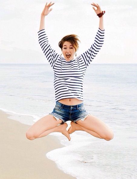
This shot is a neutral shot. I wanted it to be basic and simple. The lighting is again, only sunlight however, I used a white piece of card as a reflector and placed it under the chin, angled up to the right. By doing this, it brightened up the image. The main thing I wanted was for her eyes to be bright and full of colour and personally, I think I achieved that. It gives a pop of colour without it being overwhelming but enough for her to look striking.


Silhouette :

I like this image because of the perfect outline of the woman against the hight contrast of the fountain. I also like how although the legs aren't in the waterfall they've still visible because of the reflection of the colours on the wet ground. Although there is some light in the background, it doesn't take away from the main focuses as they're warm colours. However, if they'd have been white lights, it would've have taken away.

When I looked back on the last image, I wanted to re-create the image but with two people as I thought it looked romantic. So, I asked the woman and man if it was ok for me to take a picture of them and if so, I would send the image too them. They agreed and I proceeded with taking images however, I personally don't like this image as much as the last. The main factor is the wind pushing the fountain to the right. It makes the image look uneven. Also, The lights in the background are distracting as there is more detail in the background in this image than the last, even though they're warm coloured lights.

This image was shot on bonfire night. The only light was the bonfire. In my family, bonfire night is a night we all gather together so, I wanted to capture all the people together. By doing this, it shows that it makes the image look full. The thing I enjoy most about this image is the fact that there is a person directly in the middle of the bonfire, then as the people go out on either side, their silhouettes become less noticeable. Overall, I really like this image.

Again, like the last image, the main light source is the bonfire. I chose this image to evaluate wasn't only because of the silhouettes, it was because of the detail in the bonfire. The specks of fire going upwards really adds detail into the black parts of the image. Also, you can make out the wood in the fire which adds detail to the fire. Although there is only a few silhouettes, they're all looking in the same direction, creating the impression that they've socialising with each other. 

Contact Prints;